
The Top 5 Mistakes You Need To Stop Making With your Powerpoint Presentation Design
We doubt there’s a single person in Australia under 60 who has never made a PowerPoint presentation. The art of presentation design is tricky, and there seem to be so many rules to the perfect PowerPoint slide design.
At Creatik, we’re the experts in all things design-related, and our expertise extends to PowerPoint and Word template design. We’ve seen all kinds of presentations in our time, from the incredible to the appalling. So why risk a bad presentation? Creatik has professional PowerPoint designers to help make your next presentation look amazing. In the meantime, we’ve made a list of the top 5 mistakes people make with their PowerPoint design so you can avoid them.
Colour

Colour is always tricky to get right, especially if you’re creating a PowerPoint presentation with a lot of imagery.
Poor contrast. If you’re using a yellow background, don’t use white text. If you’re using a black background, don’t use dark blue text. Make sure your text is well contrasted so everyone can read it.
Using too many colours. If you decide to use every colour of the rainbow in your presentation, you’ll find it hard to maintain consistency and balance, so settle on a palette before you begin.
Using too few colours. If you only have 2-3 colours, your presentation will get boring very quickly. We’d suggest choosing 2-3 primary colours and 2-3 secondary colours to use throughout your presentation. Make sure your brightest colours are used to highlight key points.
Layout

Some people go overboard, whereas others go under with their layouts. Finding the balance is difficult.
No consistency. If you click from one slide to the next and your audience is left wondering whether they’re looking at the same presentation, you need to take a good look at your consistency.
Too many images. Unless your pictures have direct relevance to the topic you’re presenting, don’t use them. Including pictures for the sake of it is going to confuse your audience.
Forgetting about alignment. So many people overlook alignment in their PowerPoint presentations! The distribution of text and images can make or break the appearance of each slide.
Overcrowding. Not everything needs to be crammed together on one slide. Make sure your slide looks neat and easily digestible. If you’ve got a lot of information to pack into one slide, consider splitting it up over two.
Typeface and font

Stop what you’re doing and step away from the Comic Sans typeface. No one needs to get hurt; just back it up…
Using typefaces that are hard to read. While they might be fine for titles or small amounts of text, cursive or illegible fonts are a strain if overused. We’d recommend sticking to the tried and true Times New Roman, Arial, and Calibri.
Using odd font sizes. Headings that are enormous above text that’s teeny-tiny will be jarring for your audience, so try to maintain some consistency throughout your presentation.
Using too many typefaces. We don’t need to see the entirety of Microsoft’s font offerings in your PowerPoint. Instead, pick a couple of key typefaces and fonts and stick with them throughout the presentation. For example, we’d suggest a serif and a sans serif that complement one another.
Content
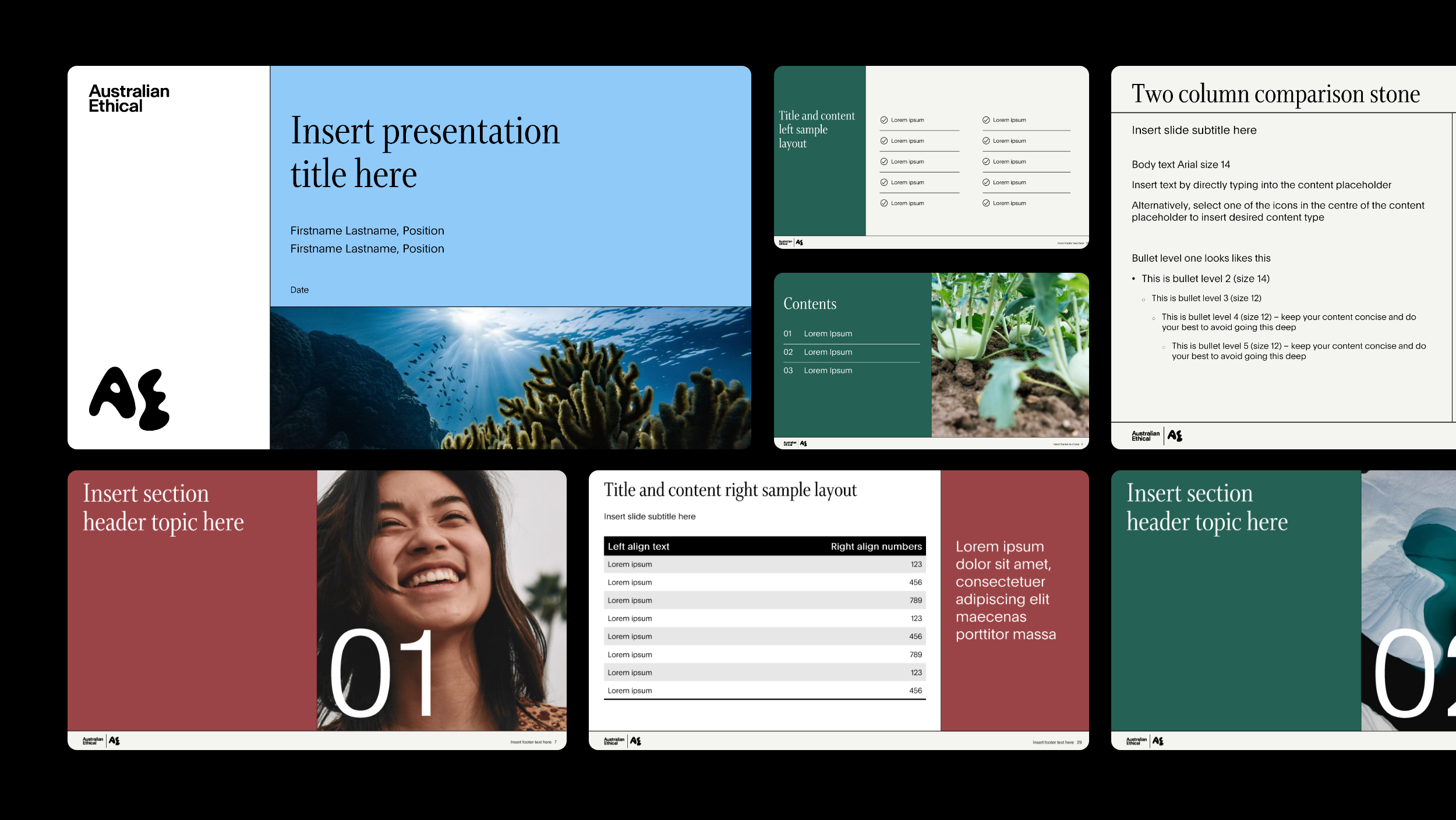
The decision of what you should and shouldn’t add to a presentation is tough. After all, you want your audience to know what you’re talking about! However, try to avoid the following mistakes.
Using complex charts. The rule of thumb with effective PowerPoint design is simplicity. You want to convey your message and data as easily as possible, so avoid using complex, overwhelming charts.
Using too much written content. We get it, you want to reiterate all your talking points within your presentation, but no one wants to read a novel within a PowerPoint presentation. Plus, if people are reading all your dot points and paragraphs, they won’t be able to pay attention to anything you’re saying.
Using transitions. Yes, the origami transition is cool… if you’re 8. Hard transitions are clean and effective, so avoid the fade, the dissolve, and the cut-across transitions.
Poorly formatted images. Grainy pictures, watermarks, and white backgrounds are all hallmarks of some poorly formatted images, and they’re not pleasant to look at.
Using ClipArt. ClipArt signals to your audience that you couldn’t be bothered to go out and find high-quality images to use in your presentation. They’re lazy and tacky and will take away from the professionalism of your presentation.
Creating It Yourself
You might know the basics of PowerPoint design, but you probably won’t have the expertise our team of professionals have up their sleeves. Creatik specialises in creating dynamic, impactful presentations that won’t leave your audience bored. We’ll develop infographics, custom animations, and onscreen builds that will add depth and character to your presentation as well as aligning perfectly with your brand strategy and identity. We’ll do everything for you except for presenting your pitch; the ball’s in your court for that one.
Creatik can help you create your next presentation design
At Creatik, we do design a little bit differently. We have the skills, the experience, and the creativity, but it’s how we apply them that sets us apart.. We strive to wow our clients with our ideas, execution, and service, incorporating innovation, dedication, and integrity into everything we do. We’re passionate about great design, and we won’t rest until we deliver a product that meets and well and truly exceeds your expectations. We’re here to work with you to translate everything your business is and does into captivating presentations, websites, marketing materials, and merchandising, creating out of this world graphic design solutions that fit your needs, budget, and timeline. If you need help with presentation design, contact Creatik today to learn what we can do for you.