Made Property

Brand Refresh
Tone of Voice
Design System
Implementation


From solid foundations to elevated ambition

Since 2013, Made Property has been shaping Sydney’s residential landscape with a vertically integrated model that controls every step of development and construction.

Their reputation for trust and quality was already strong, but their brand needed to catch up. Made Property approached Creatik not for reinvention, but for refinement, an identity that could elevate market perception, bring consistency across touchpoints, and mirror the craftsmanship of the homes they create.


Designing an evolution, not a revolution

We set out to refine what Made Property already did best. The logotype was carefully restructured to bring clarity and balance. A new typographic pairing of serif and sans serif introduced warmth and character while retaining functionality. The palette shifted to natural tones — stone, jet, copper and cream — to soften stark contrasts and complement architectural photography.

At the heart of this refresh sits their existing line Made for Life, a phrase that holds dual meaning: homes built to endure and spaces made to enrich daily living. Subtle design details, inspired by the care of luxury craftsmanship, allowed the identity to feel both cohesive and personal across every application.


A confident brand, made for life

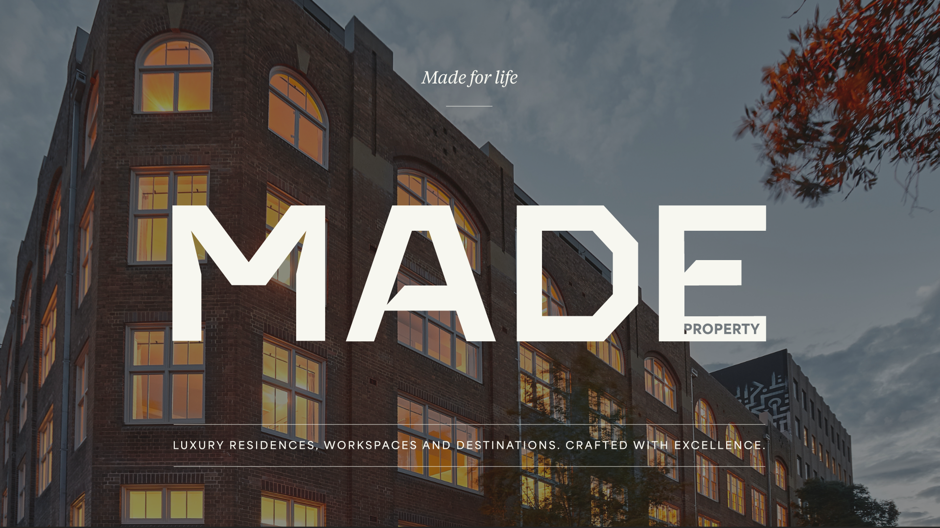
The refined identity rolled out across every channel, from digital platforms and corporate stationery to hoarding, uniforms, vehicles and social media.

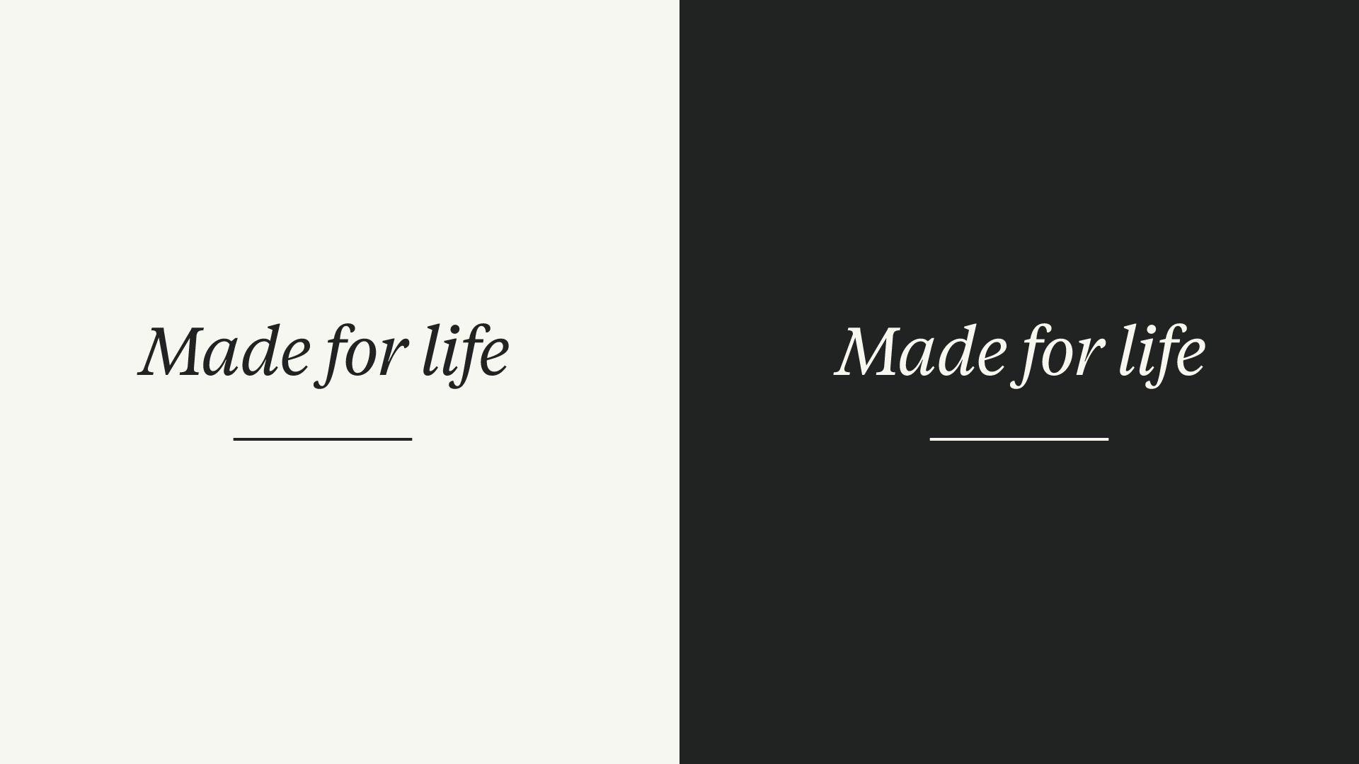
Each touchpoint now carries the same hallmarks of trust, detail and understated luxury that define Made property’s work.

The result is a brand identity that feels confident and timeless, communicating who Made Property is today: design-led, people-focused, and built for life.