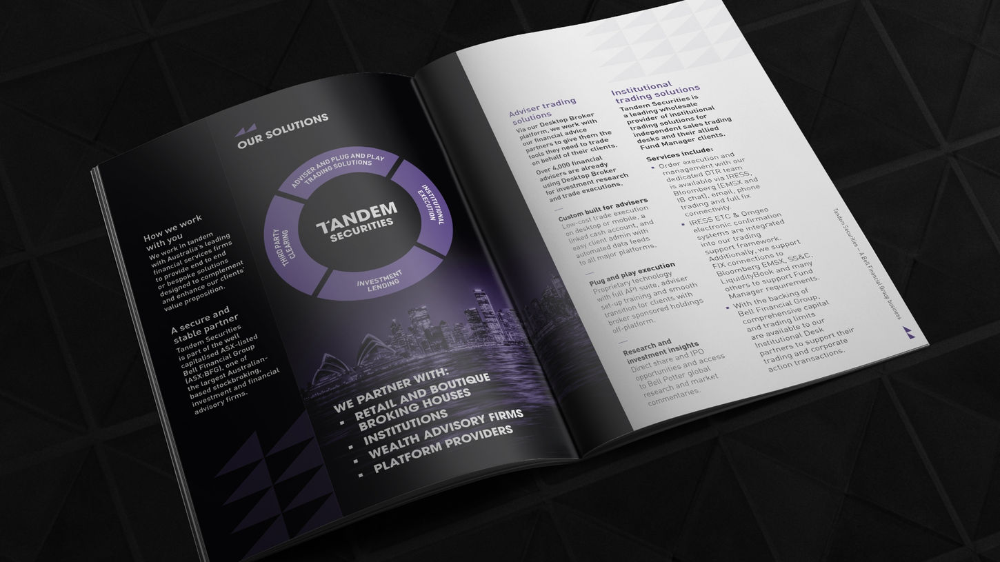
When things or people are in tandem, they’re together — either physically side by side, happening at the same time, or working as a cohesive team. With this in mind we developed a new brand identity for Tandem Securities, an end-to-end platform providing bespoke solutions for wholesale and institutional clients requiring trading, clearing, and investment services.
The ‘T’ from Tandem features a triangle edge, derived from the talking line used in the Bell Financial Group logo. The ascending triangle indicates a positive upward progression and joins with the ‘T’ conveying connection and working in partnership.
This device is replicated throughout the concept in a tandem lock up, emphasising collaboration and working alongside partners. The original ultra violet purple colour has remained consistent ensuring a direct link back to Bell Financial Group. Purple represents partnership, the calm stability of blue and the dynamic energy of red.


