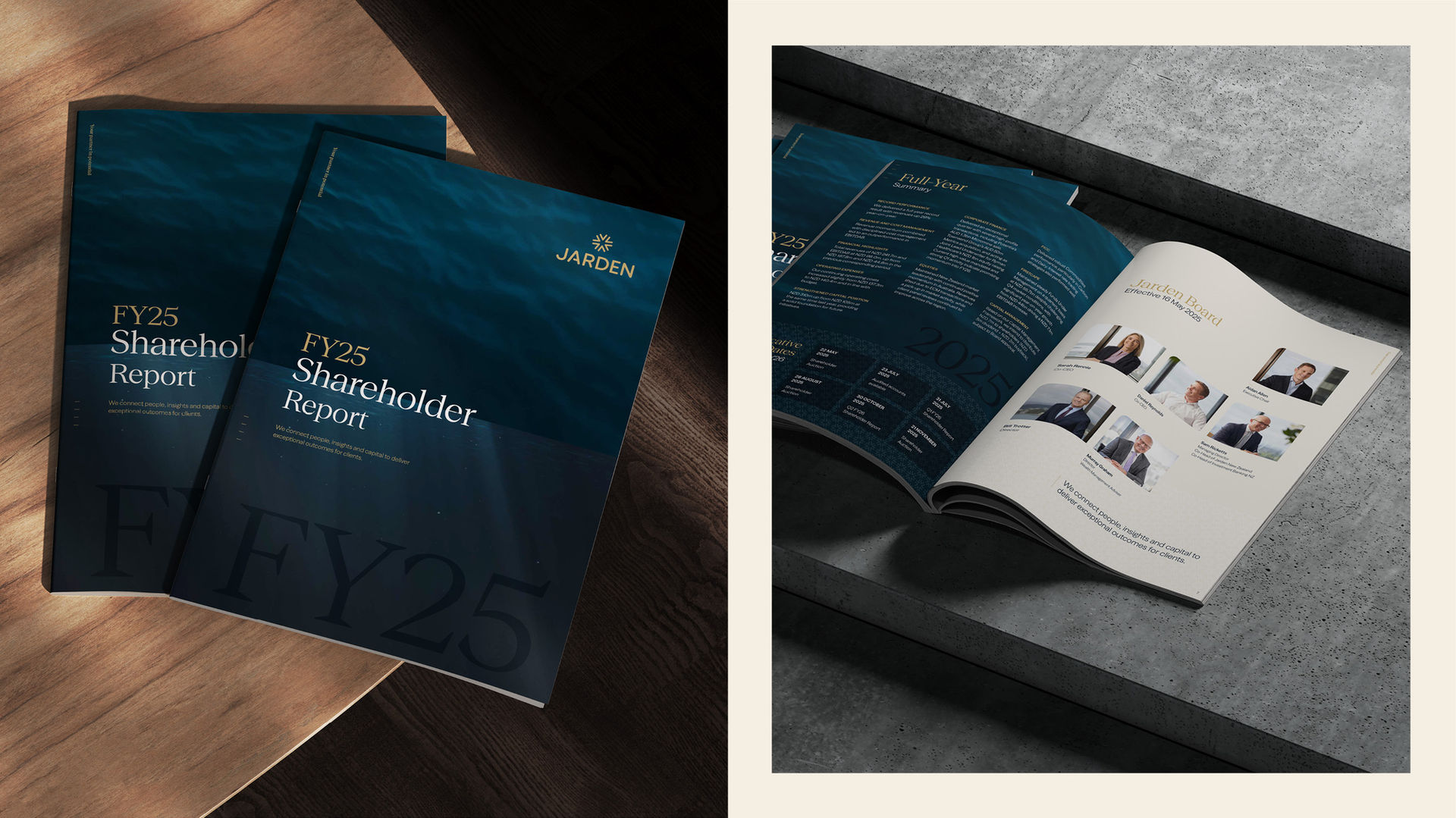
In 2024, Jarden, a leading independent investment and advisory group, embarked on a brand refresh. Having expanded into Australia in 2020 and divested its wealth management arm, the firm wanted to strengthen brand recognition and reflect its position as an integrated trans-Tasman investment bank. The goal was to bring greater sophistication to the brand, matching the depth of Jarden’s expertise and ambition.
The Brief
Jarden's objectives were clear: develop a refined brand identity that resonates with high-net-worth investors, advisors, and institutions—while retaining the logo in its current form. The refresh aimed to portray Jarden as agile, responsive, and free from bureaucracy, with approachable leadership and a winning culture. Deliverables included two brand concepts, comprehensive guidelines, and refreshed templates to ensure cohesive communication.
Our Response
We conducted a thorough audit of Jarden's existing brand, identifying elements to retain, refine, or retire. The deep blue and gold colour palette remained, symbolising trust and prestige. However, we introduced a cooler, more muted palette to add depth and modernity. Typography was overhauled, replacing the dated Playfair typeface with the contemporary Seasons font, offering both serif and sans-serif options for versatility.
Imagery was curated to evoke the ocean, symbolising depth, calm, and boundless possibilities, reflecting Jarden's expertise and the vast potential it offers clients. We developed a cohesive image library and a consistent iconography set to enhance visual communication.
The Outcome
The refreshed brand positions Jarden as a sophisticated, integrated investment banking entity, resonating with clients and employees alike. It reflects Jarden's commitment to delivering exceptional outcomes through independent, agile, and responsive service. The new identity not only honours Jarden's heritage but also sets the stage for its future growth across Australasia.


